

For the Kleiner Perkins 2021 Design Fellows application, I was tasked with “redesigning a feature of a Kleiner Perkins company’s product.” I chose to redesign Coursera because I have used Coursera before.
While reading through some App Store reviews, I noticed there were a lot of complaints about the UI and app design in comparison to the web experience, which made people’s experience of the app more jarring and disjointed.
And so, how might we redesign the Coursera mobile app for a better user experience ?


Coursera is a massive open online course (MOOC) provider, with thousands of courses.


Users are now able to save courses. Their saved courses can be viewed from their Profile
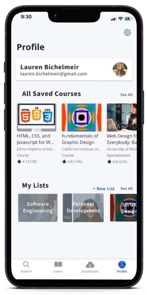

There are so many courses that one could save, so the list feature enables the user to organize their courses any way they want: by topic, by due date, by purpose, by how they want to learn, etc. This was a feature inspired from SkillShare
Save a course with the bookmark. All saved courses can be viewed in All Saved Courses. The user also has the option to save that particular course to a list - either an existing list or create a new list
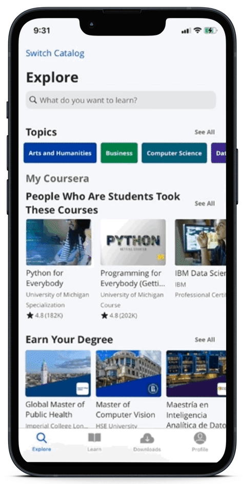

Users are able to add their interests, resulting in a more tailored experience when exploring courses. This was a feature inspired from LinkedIn Learning
The user is now able to easily view their latest progress in the course. Clicking on the course leads to their last watched video (at that timestamp) or their latest assignment

My next steps would be to conduct usability testing to see if my new features are intuitive to use and interview more Coursera users to gain a better understanding of their experience
When deciding what company to redesign, it was a lot easier for me to approach products that I have used because being a user myself enabled me to better relate and empathize with the users.
It was also a new experience to redesign for an existing product/company and to make sure that my design and experience would be cohesive and intuitive with the existing app that Coursera has. It was an exciting challenge to design within Coursera's existing design and user flow!
Credits to The Noun Project for the icons!
